
Rethinking Millennial Gray
For a color that once felt like it lived on every wall in America, gray has become surprisingly divisive. It’s been called dated, overused, even "the most hated color in existence." I understand the fatigue, but I’m feeling compelled to gently push back on some of these verdicts.
House Beautiful recently asked for my thoughts on whether millennial gray has really run its course, and why so many people are ready to call it "out." After years of designing and renovating homes, I have learned that no color is ever truly finished, gray included.
So here's how I approach using gray, where I think all this hype came from, and why I think gray, when used thoughtfully, still earns its place in a beautifully layered home.
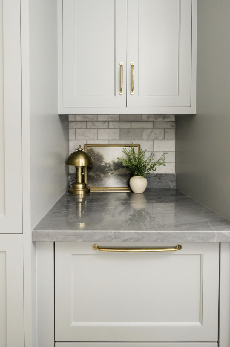
Photography by Madeline Harper
The Appeal of an Easy In-Between
Part of what made millennial gray so attractive was that it felt safe. Instead of a bold departure, it was an easy next step for anyone ready to move on from white-painted rooms.
In many ways, gray is a gentle bridge. It’s a short leap from white into something with a little more depth, and for a lot of homeowners, that was the invitation they were looking for.
How We Got Here
I remember working under production builders during the height of the "greige" craze in the 2000s, and vividly recall that marriage of gray and beige that seemed to explode overnight. It felt like a natural evolution from the "builder's beige" and faux finishing that defined the 90s.
Sherwin-Williams' Agreeable Gray quickly became the color of choice. Its warmer undertone offered just enough softness to feel contemporary, and it became a favorite for new homeowners looking for a bit of an edge. Looking back, it makes perfect sense that it caught on the way it did.
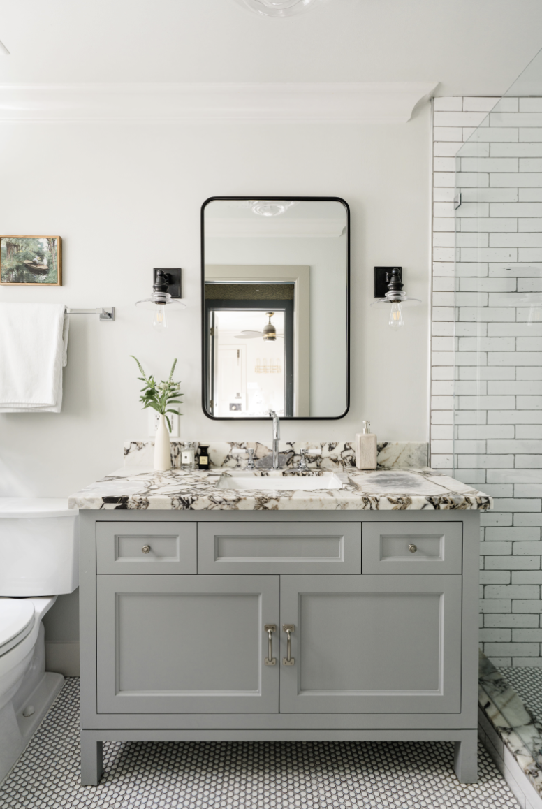
Photography by Madeline Harper
Is Gray Really “Out”?
Every so often a client will ask me if gray is “out,” and it’s usually when they’re ready to refresh a room or two. But isn't it our role as designers to guide how color is used, to set the tone, and sometimes to revive what others might consider passe?
When clients see a full concept, with finishes, materials, and colors presented together, their perception of a color shifts entirely. At the end of the day, no color is ever really off the table.
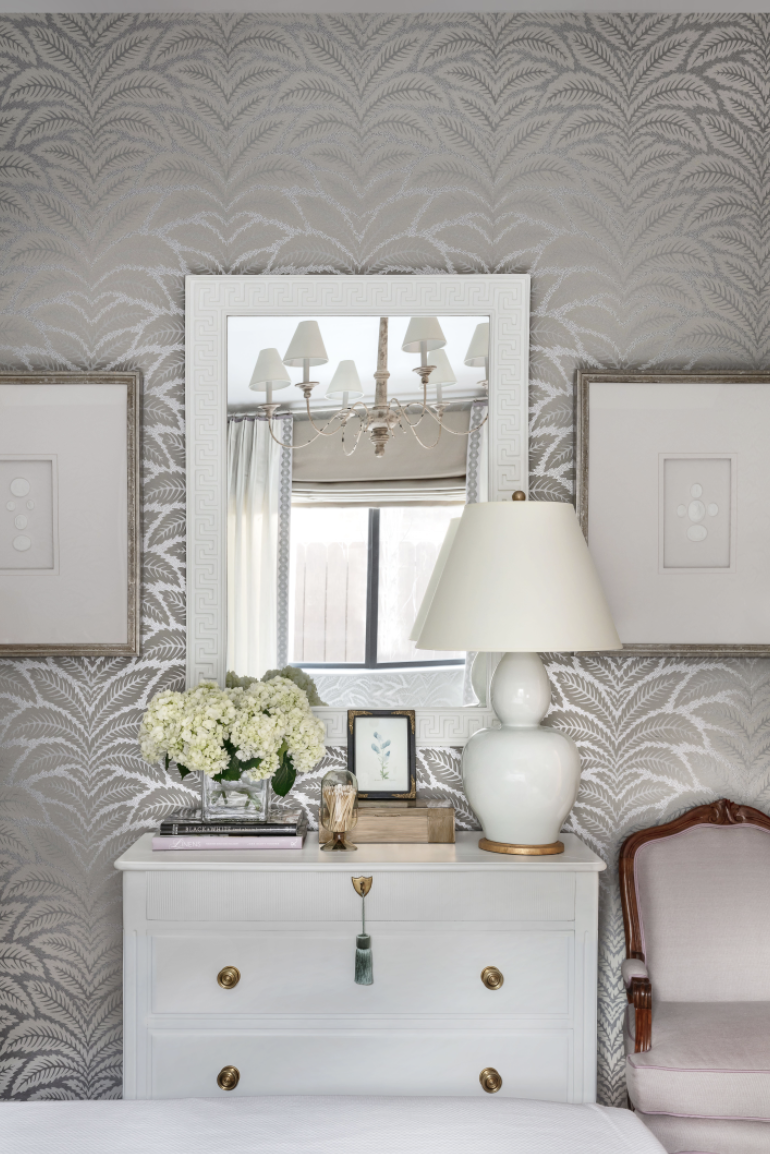
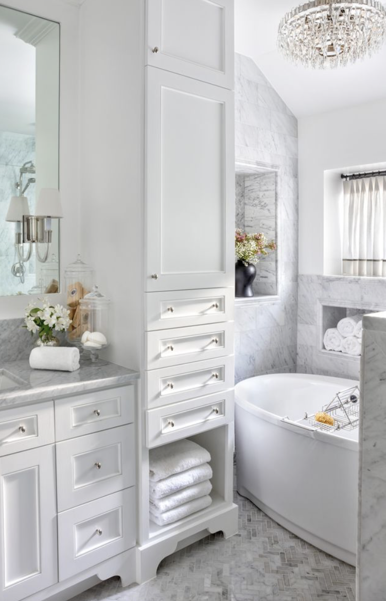
The Grays I Still Reach For
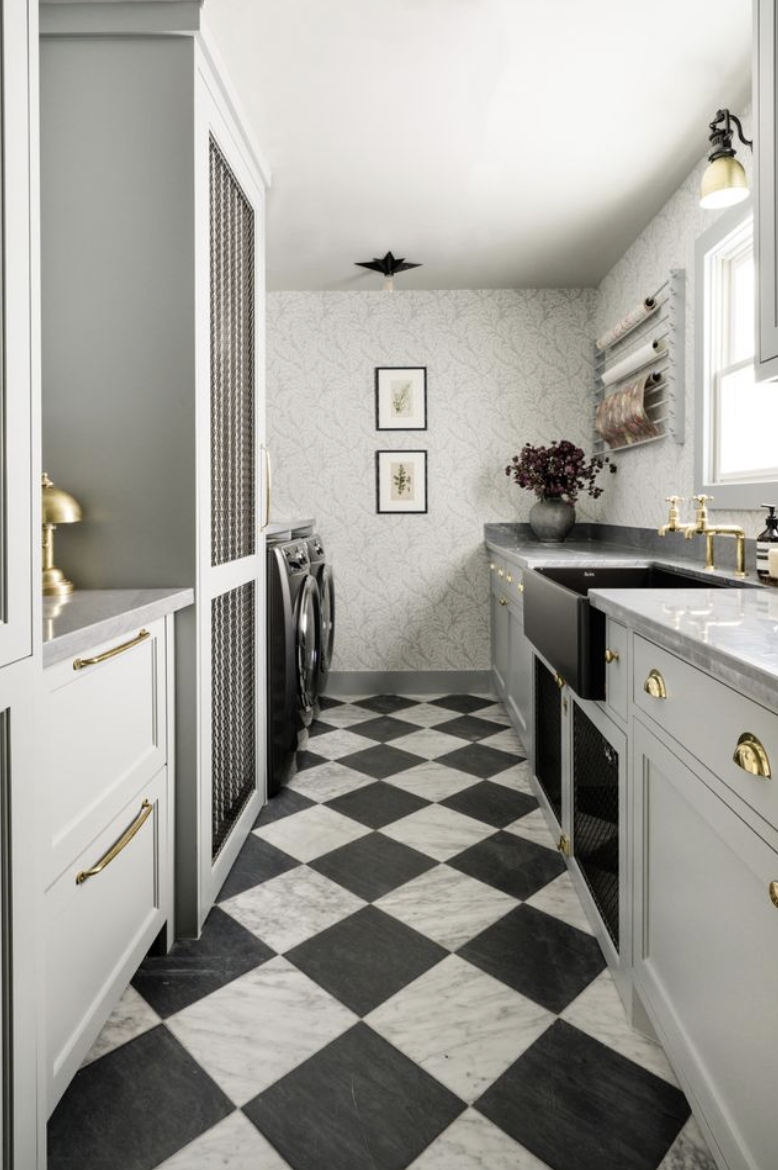
I'll be the first to admit that I'm not here to defend 'millennial gray' as a design trend. But grays as a family? Those I love, and there are a few from Benjamin Moore that I return to again and again:
Gray Owl 2137-60 for a bright, airy alternative to white.
Gull Wing Gray 2134-50 for cool, silver undertones.
Revere Pewter HC-172 is a great warm hue that leans taupe, and Edgecomb Gray HC-173 is fantastic on carpentry and millwork.
And for something moodier, Chelsea Gray HC-168 has a brown undertone that looks so handsome with darker woods.
Photography by Madeline Harper
A Case For Gray
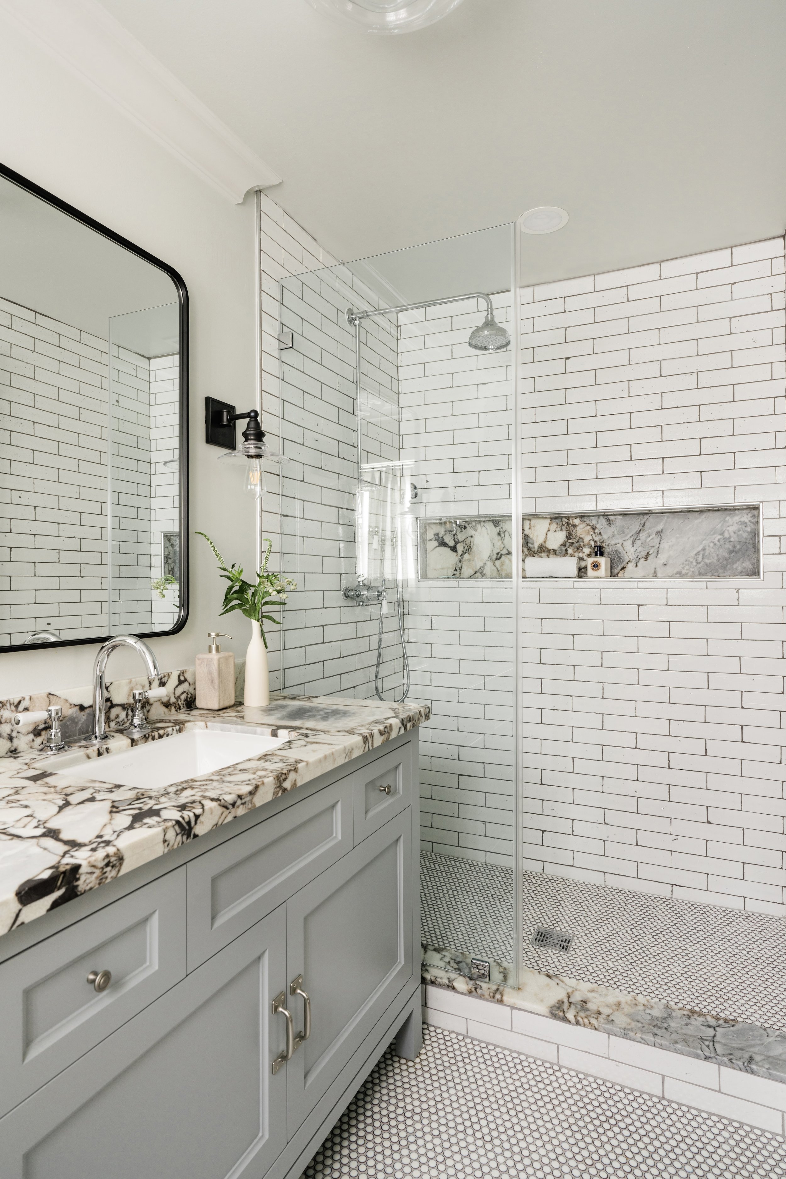
In this bathroom renovation, reimagined as a guest bath once our client's son headed off to college, we wrapped the entire room, walls and trim alike, in Benjamin Moore's Gray Owl, letting that soft, even wash of color do the work.
For the vanity, I reached for Gull Wing Gray, a cooler shade with subtle silver-blue undertones drawn straight from the marble slab.
That gorgeous slab was actually at the heart of it all. Veined in black with the faintest blush of rose, it tied the whole room together in a way that felt effortless. Layered with mixed metal finishes, the palette landed somewhere fresh, current, and timeless all at once. Proof that, in the right hands, gray still has so much to give.
Making Room for Color
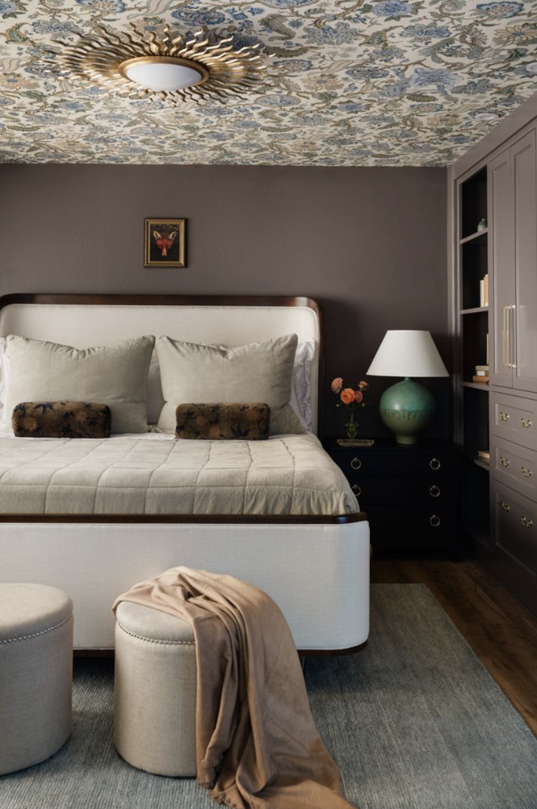
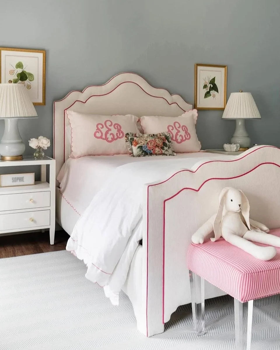
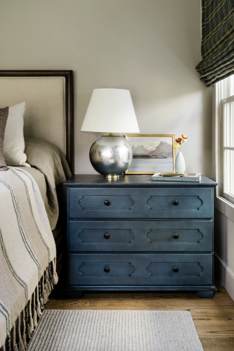
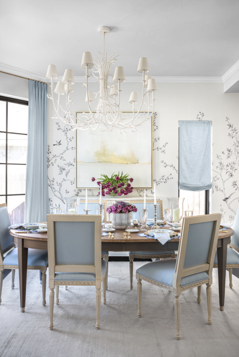
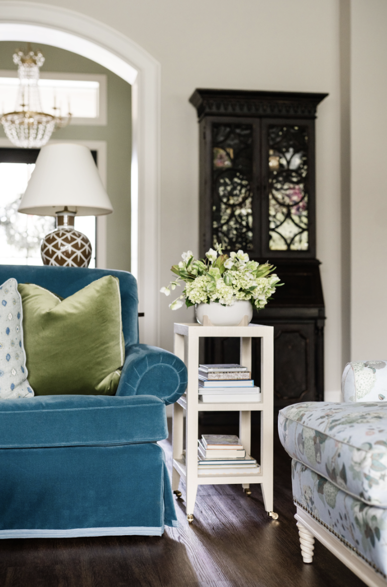
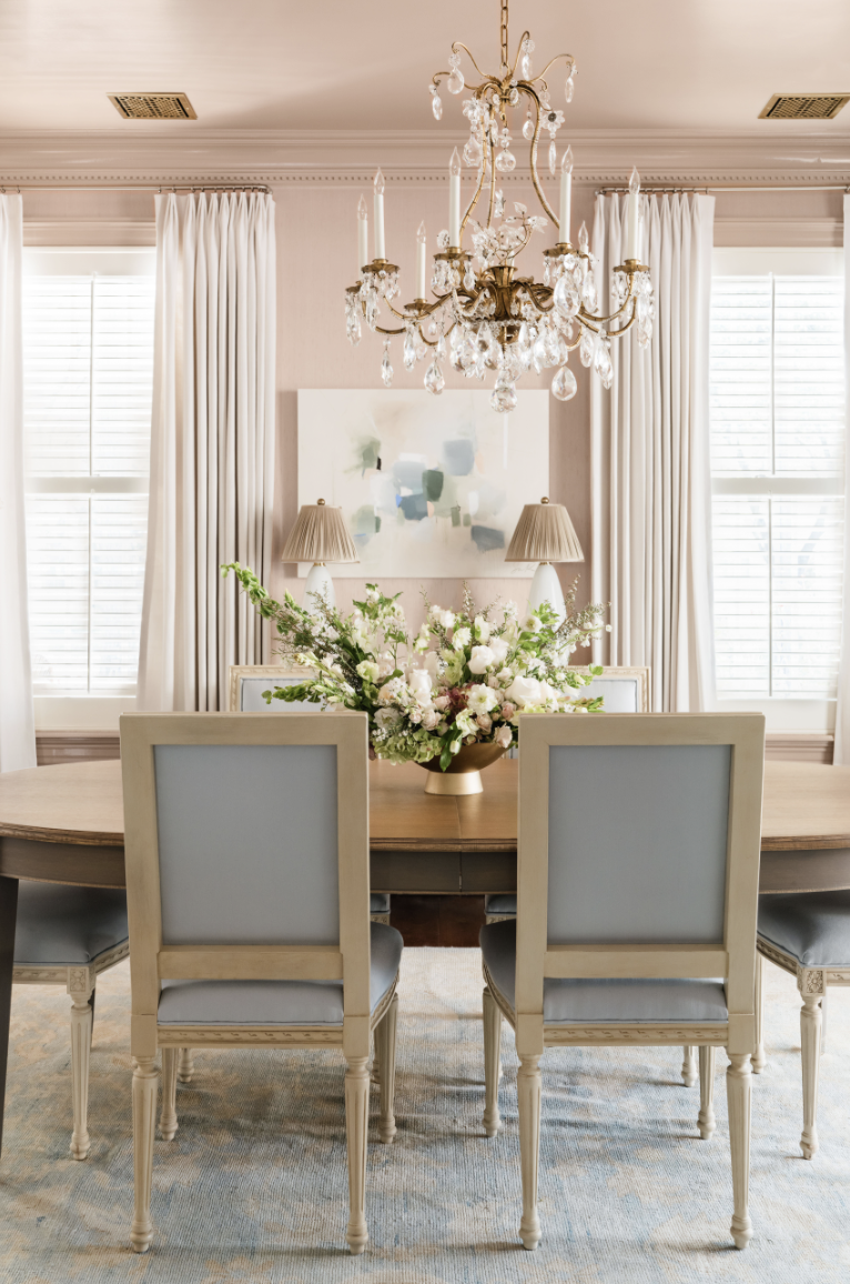
The shift I’m seeing has less to do with gray falling away and more to do with how we’re choosing to live with color now. American homes are embracing vibrant hues again, and living with them more freely. Muddier browns and greens have gained real momentum, and blue, in all its shades, remains a perennial favorite. Color feels less like a risk these days and more like a welcome place to play.
Build Your Palette
Gray is still a beautiful addition to any home. It's all in how you build the palette around it. I love working with muted undertones and blending colors so they feel intentional, not flat. Remember that temperature does a lot of the work here — a cool gray reads completely differently next to warm materials than it does next to cool ones, and all shades behave differently depending on the light, the finishes, and everything else in the room.
Trends will always come and go, and that's part of the fun, but a color is only ever as good as the story you build around it. Whether you're holding onto the grays you love or ready to move toward something warmer, we would love to help you build a palette that feels like you.


Choosing the right white paint isn't as simple as it looks. I’m sharing my no-fail favorites, from warm and creamy to crisp and modern, plus the tried-and-true shades I reach for again and again.